Data Visualization

During my second semester as a combined degree student, I took data visualization as a graduate elective. I enjoyed studying data visualization best practices and applying them to course projects and beyond. I also gained experience using the Tableau platform to analyze data and make many different types of graphs.
My favorite part of the course was looking at interactive, aesthetically pleasing charts with fancy fonts, colors, and other design elements, and then figuring out how to make creative yet easy to understand charts on my own.
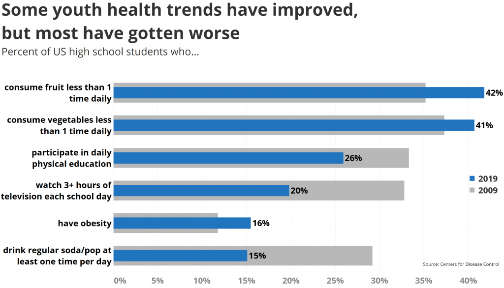
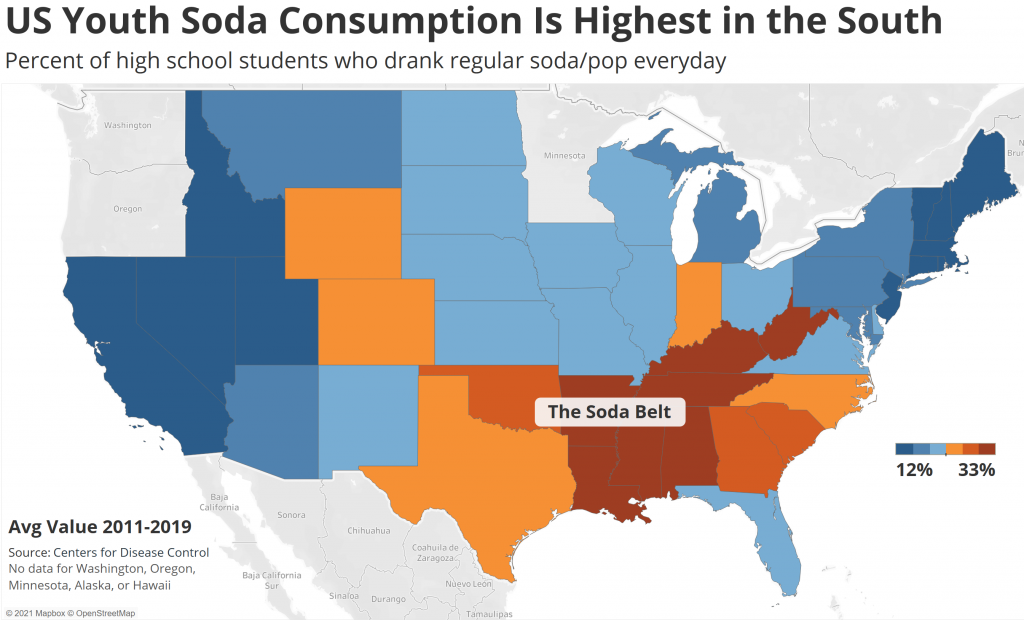
I focused on a CDC dataset about youth nutrition, physical activity, and obesity to create most of my visualizations. I put together a PowerPoint presentation to share my findings on youth health trends, and for my final project, I wrote a data memo where I analyzed the data and made recommendations for my chosen audience.
Check out my work…
DATA MEMO (final project)
Youth Health Data Presentation Video
Youth Health Data Presentation Slides
I am sure I will continue to use the data visualization skills I gained in this course, and I can see myself using Tableau for many purposes in the future, whether personal or work-related.